The Influence of Open Office Design on Learning Environments
I recently stumbled onto a LinkedIn article about the history of the open office space design. As a 45 year old who doesn’t like change and came up in the golden age of the cubicle, I have always resisted the idea of the open office space. While these spaces are touted as social and collaborative, I question how much productivity can happen in this work environment. The author even argues that while Frank Lloyd Wright created a stunning and effective open office space in 1939 for SC Johnson, the open office spaces of today are scientifically proven to be ineffective.
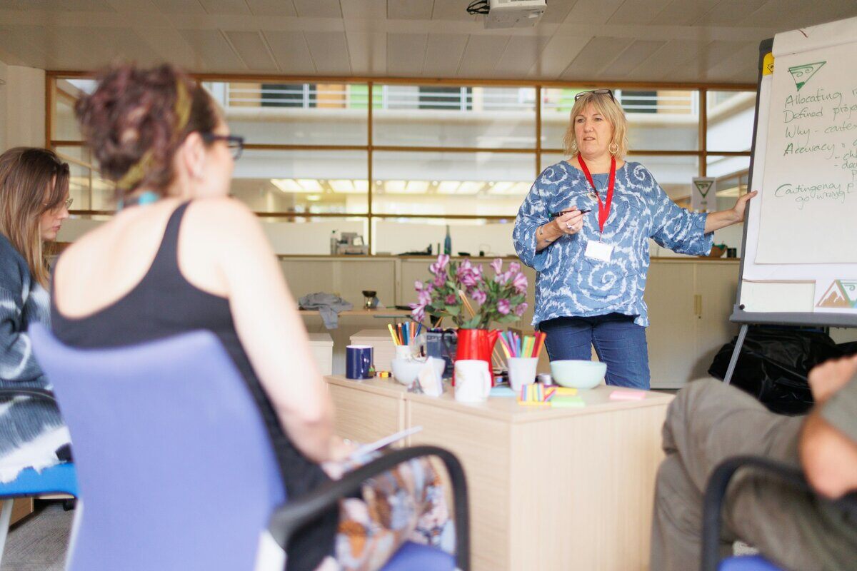
I started thinking that there may be a correlation between modern office spaces and modern learning spaces. What do an office and a “classroom” have in common? Both spaces are learning environments and both have experienced a major shift in the last several decades.
This sparked my thoughts on two levels. First, what lessons can we take away from the history of the open office environment and how can we apply our findings to the rapid changes in our learning environments? And second, how can we design spaces and learning environments to be cost efficient as well as thoughtfully designed for the learner?
Lessons Learned
Just as our offices spaces have shifted and changed over the past several years, the criteria for working spaces are very much still the same. Employees need an organized space for working independently and a common area for more collaborative work. The same holds true for learning. As the shift to online learning has exploded, the basic needs and desires of the learner remain the same.
Learners are seeking dynamic content in both independent and collaborative spaces. As learning design professionals, we need to be able to think outside the box, use new innovative technology, and meet our learners where they are. Whether delivered in a coffee shop or a classroom, our content must be strong and engaging. This means that the planning and design of our content needs to be deliberate and thoughtful.
Critical Design
Like Frank Lloyd Wright, when we are thoughtful and deliberate, we will create spaces that our clients will not want to leave. However, when we copy or change environments without understanding our learners, these spaces then fall into the category of poorly designed.
At our institute, we ask our designers to take a few “extra steps” when planning content. We use visions boards and create learner personas prior to the design stage. This ensures that the learner is always our first consideration. In our second and third steps, we consider learning outcomes and build high level road maps for achieving these outcomes.
When we take the time to add these steps to our process, we can design learning with intent. At first glance, some view these “extra steps” as adding time and money to an already busy and time consuming process. But the opposite is actually true. Time and time again, our clients have found that by adding these deliberate steps to the design process, they are able to follow a clear roadmap to success, create content that meets the needs of the learner, and keep teams on track for quicker development.
Subscribe To Our Blog
Most Popular
Post By Topic
- associations (2)
- blended learning (2)
- CLEA (3)
- community of practice (1)
- Continuous Improvement (1)
- covid (1)
- culture (1)
- customer engagement (1)
- Design Studio Session (7)
- designcast (2)
- E-Learning (2)
- engagement (1)
- equity (1)
- ILED (6)
- ILED Designcasts (4)
- Innovation (4)
- learning design (25)
- learning enviroments (22)
- learning innovation, (4)
- Learning Strategy (8)
- LEM Techniques (3)
- micro-credential (17)
- Powered by LEM (5)
- professional learner (2)
- Show Notes (4)
- Skills Gap (2)
- technology (3)
- Uncategorized (11)
- video (1)
- visualization (10)
- Workshops (1)


